



Ortus Font
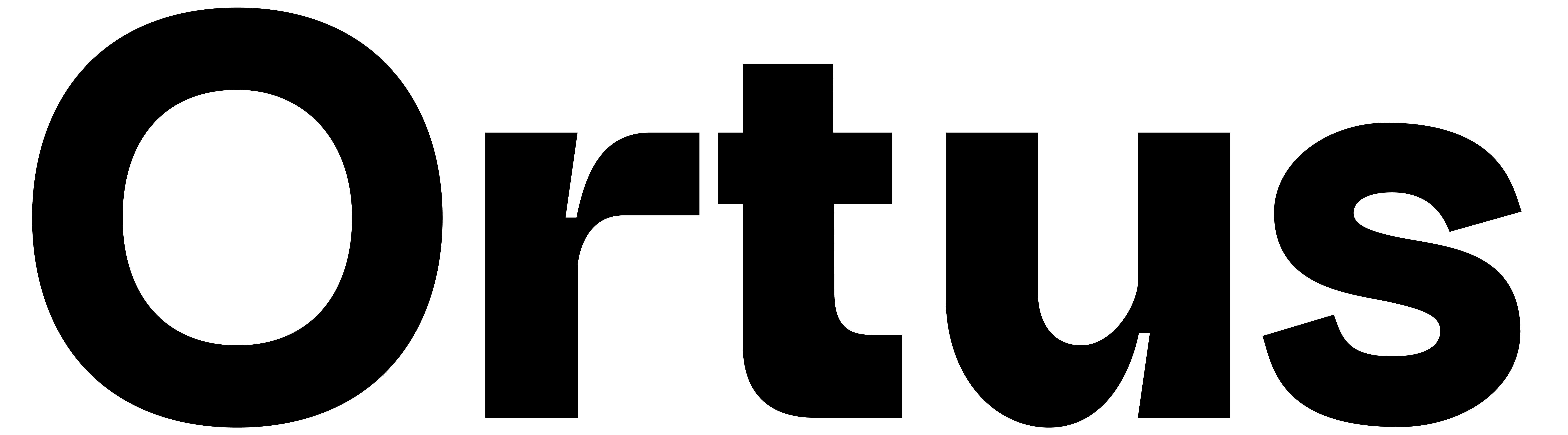
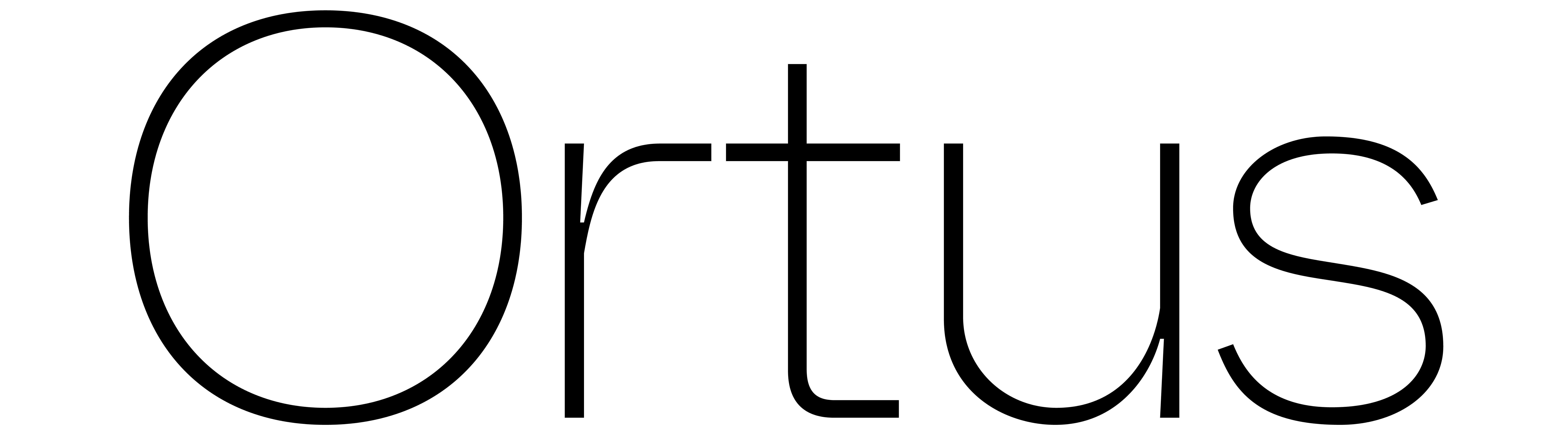
One morning, without warning, the page turned. There it lay—stretched across the white like it had always belonged, its form neither resting nor resisting. Calm, at first glance. Breezy, almost careless. Letters unfolded, as if designed to be overlooked—yet the more one looked, the more it pulled. A rhythm ticked beneath its skin. Clean lines that curved ever so slightly off-center, sharp not from violence but precision. The quiet kind. Ink traps in silence, catching the excess and the eye. A grotesque lineage, softened by modern grace. Wider than expected, but not boastful. Just enough space to breathe, just enough to raise suspicion. It held something curious in its stance. Something teasing in the weight of its strokes. Subtle shifts from line to line, as if the typeface itself were slowly changing, mid-sentence, while pretending not to.
16p
Rhythmically Poetic
A contemporary grotesque typeface with clean, slightly off-center curves and precise detailing. Ink traps balance function and character, giving it a quiet sharpness. Wider proportions provide openness without excess, while subtle variations in stroke weight add a sense of movement and intrigue. Rooted in grotesque tradition but softened with modern refinement, it feels approachable and sophisticated.
32p
Sharply Objective
Calm at first glance, yet quietly persuasive. A typeface that balances tradition with modern refinement.
64p