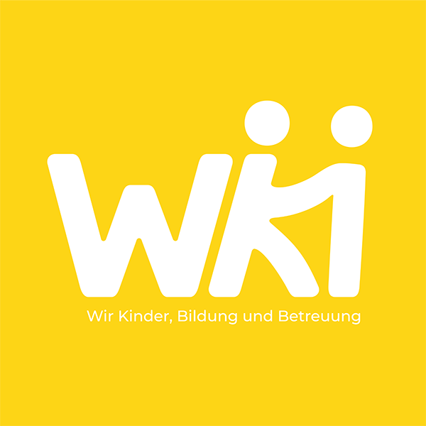
Wiki Logo
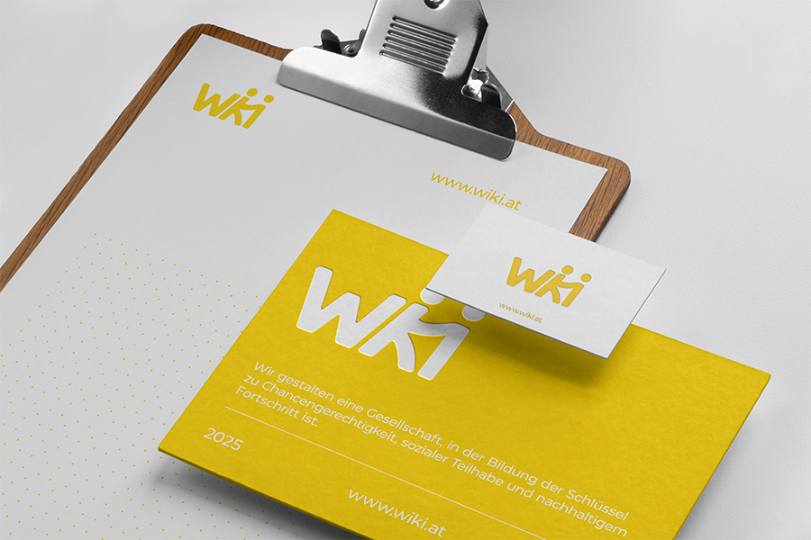
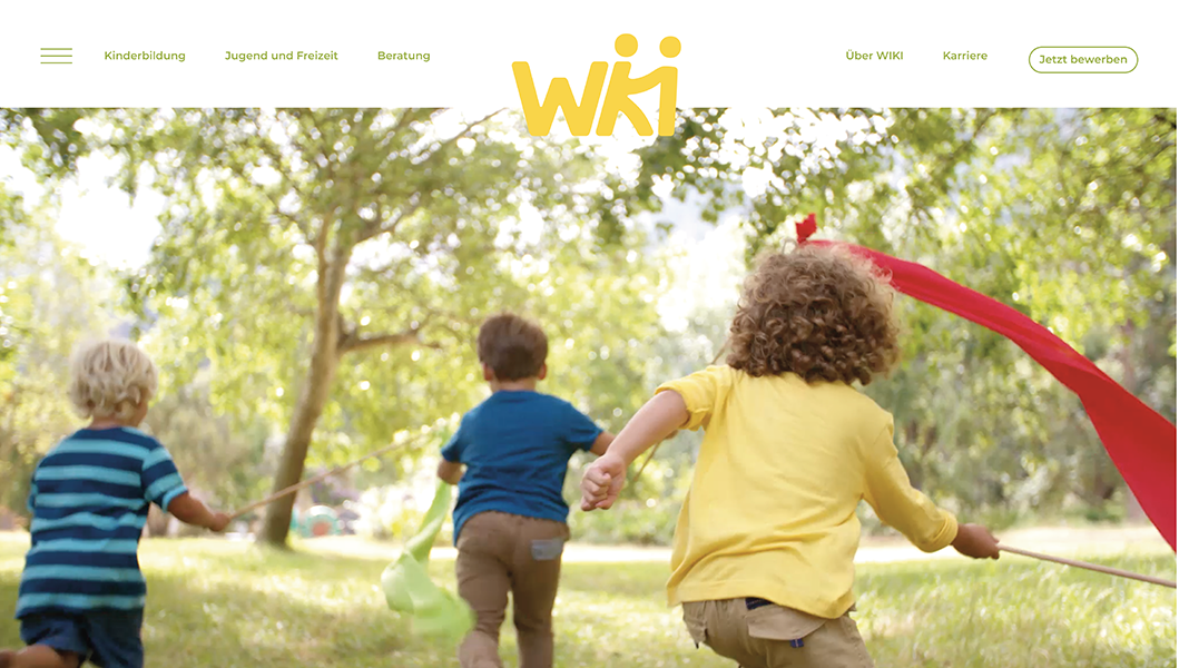
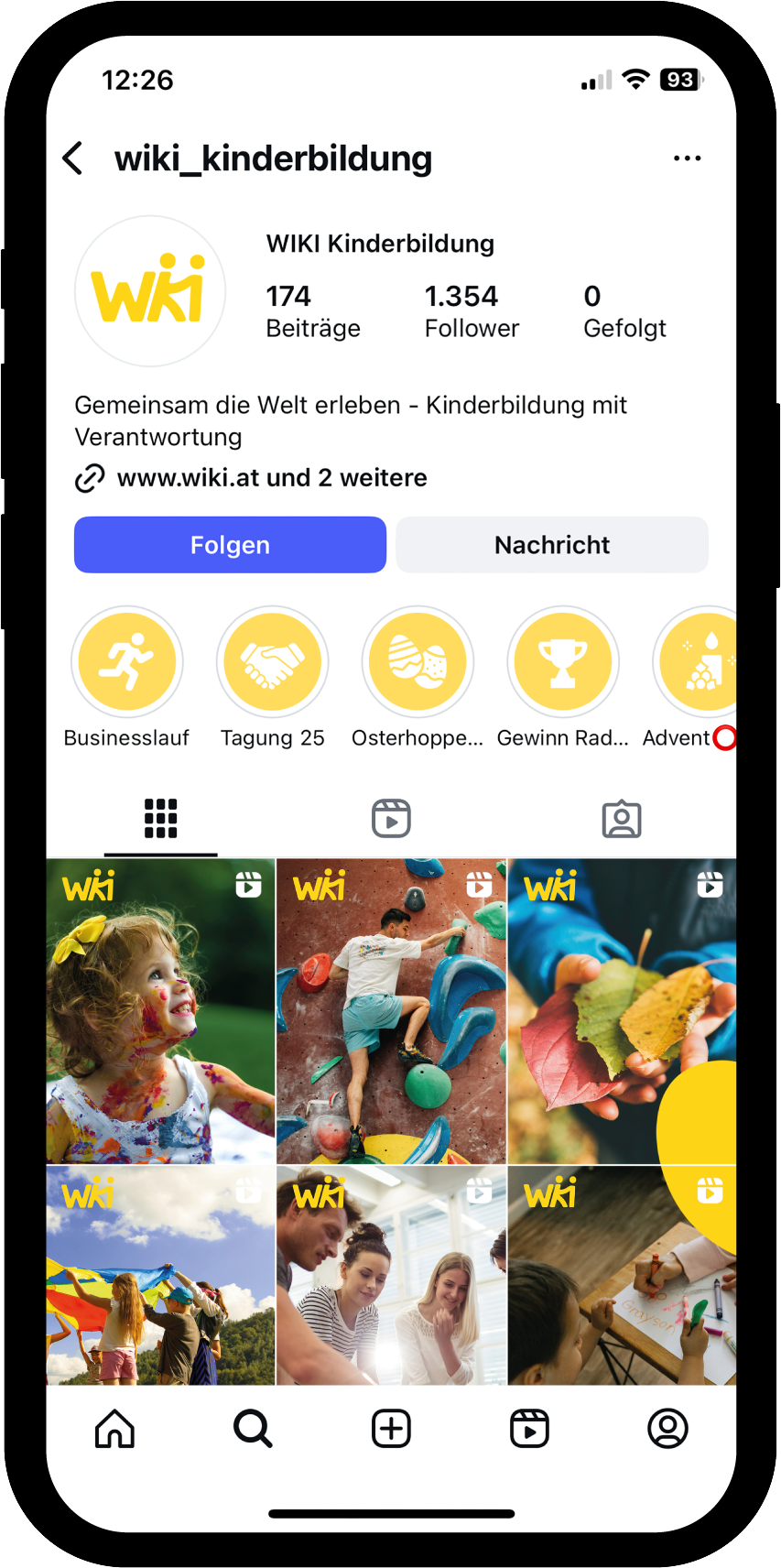
This Logo for a kindergarten company combines a clean typographic approach with a distinctive visual icon to create a unique identity. To capture the idea of helpfulness and human connection, the stronger character isn’t just reaching out metaphorically — it’s visually extending a hand, implementing the concept on multiple levels. The overall shape follows classic design principles: balanced, symmetrical, and intentionally kept free from fleeting trends. The color palette preserves the brand’s established recognition by keeping the familiar yellow, while adding a fresh sense of energy and warmth. Finally, the soft, rounded edges were a deliberate choice — they don’t just make the design child-friendly and safe, but also give the logo a friendly, down-to-earth, and approachable personality.

Variations

In Use
